
Page Layout
All pages within the site are comprised of page headings and sections. Those sections can then be organized into groups, grids, lists, and columns.
Page Headings
Page have options for a page heading with or without a header image. This appears as default content when creating a new page. The page can then be customized as needed.
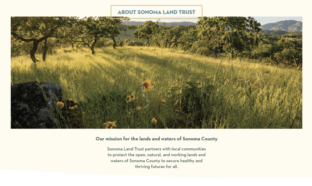
Page heading with a header image (default)
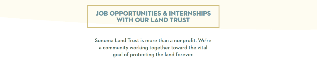
Page header without a header image
Sections and backgrounds
Often pages are broken up into different sections, separated by a background color. Any content can be placed within these sections.
Page section
This group is full width, but the contents within it uses the standard content container
Page section
This group is full width and its contents use the full width as well.
Containers
The content within a section is typically can be contained within different width groups. Most content lives within the default container, however at times a wider or narrower container is needed to accommodate the design.
Default – 1344px
By default the contents of the page is contained within a 1344px container. As your screen size decreases below 1344px, a margin is maintained so that content doesn’t run up against the edge of your browser.
Wide – 100%, up to Max 1600px
Some content is presented in a wider container. This fills the full width of your browser on smaller laptops, but has a maximum width for larger screens. This is helpful when you want to ensure a background image isn’t stretched too wide.
Full – Width = 100%
Some content should always be displayed at 100% of the screen width. This is used for section background colors, and also can be used for other components as well.
Narrow – 880px
Some content often needs to be presented in a narrower width. This is particularly helpful for readability of paragraph text.
Boxes
Content can be displayed within a box. Various settings are available to customize boxes.
Boxes can have a gold border
Lorem ipsum dolor sit amet, consectetur adipiscing elit, sed do eiusmod tempor incididunt ut labore et dolore magna aliqua. Ut enim ad minim veniam, quis nostrud exercitation ullamco laboris nisi ut aliquip ex ea commodo consequat. Duis aute irure dolor in reprehenderit in voluptate velit esse cillum dolore eu fugiat nulla pariatur. Excepteur sint occaecat cupidatat non proident, sunt in culpa qui officia deserunt mollit anim id est laborum.
Boxes can be different colors
Lorem ipsum dolor sit amet, consectetur adipiscing elit, sed do eiusmod tempor incididunt ut labore et dolore magna aliqua. Ut enim ad minim veniam, quis nostrud exercitation ullamco laboris nisi ut aliquip ex ea commodo consequat. Duis aute irure dolor in reprehenderit in voluptate velit esse cillum dolore eu fugiat nulla pariatur. Excepteur sint occaecat cupidatat non proident, sunt in culpa qui officia deserunt mollit anim id est laborum.
Boxes can be rounded
Lorem ipsum dolor sit amet, consectetur adipiscing elit, sed do eiusmod tempor incididunt ut labore et dolore magna aliqua. Ut enim ad minim veniam, quis nostrud exercitation ullamco laboris nisi ut aliquip ex ea commodo consequat. Duis aute irure dolor in reprehenderit in voluptate velit esse cillum dolore eu fugiat nulla pariatur. Excepteur sint occaecat cupidatat non proident, sunt in culpa qui officia deserunt mollit anim id est laborum.
“Boxes” can be circles
Grids and columns
Grids
Grids can be any number of items per row. The items then are displayed left to right, and naturally wrap onto a new line. All items are equal height in a grid.
Item 1
Item 2
Item 3
Item 4
Item 5
Columns
Choose the number of columns, then add items to each column. Items in one column can be different heights than items in the other.
Column 1, Item 1
Column 1, Item 2
Column 2, Item 1
Column 2, Item 2
Column 2, Item 3
Padding and Block spacing
Blocks can have padding within them so that the text doesn’t bump right up against the edge. They also have default spacing and margin between the blocks. All of these settings can be customized on a case-by-case basis.
Padding: 0px
Padding: 6px
Padding: 12px
Padding: 24px (default)
Padding: 36px
Padding: 72px
Padding: 96px
Padding: 144px
Block spacing: 0px
Item 2
Item 3
Block spacing: 6px
Item 2
Item 3
Block spacing: 12px
Item 2
Item 3
Block spacing: 24px (Default)
Item 2
Item 3
Block spacing: 36px
Item 2
Item 3
Block spacing: 72px
Item 2
Item 3
Block spacing: 96px
Item 2
Item 3
Block spacing: 144px
Item 2
Item 3